I approach every page with the same set of rules: The first person to speak should be on the left, action should move left to right, you need to establish the setting clearly, you need to establish the spacial relation between objects and figures, and the biggest moment of the page should be the biggest panel in order to give it more weight. I set these rules for the purpose of clear and effective storytelling. But every now and then these rules need to be broken if I want to convey a specific idea.
The opening sequence of The Dregs #1 is pretty brutal. It depicts a barbaric, violent act that you don’t see every day. One of my rules is to make sure the biggest moment on the page is rendered in the biggest panel. On the first page seen below, the biggest moment is when someone’s head gets chopped off. But when I originally roughed it out with that rule in mind, the scene felt wrong to me.
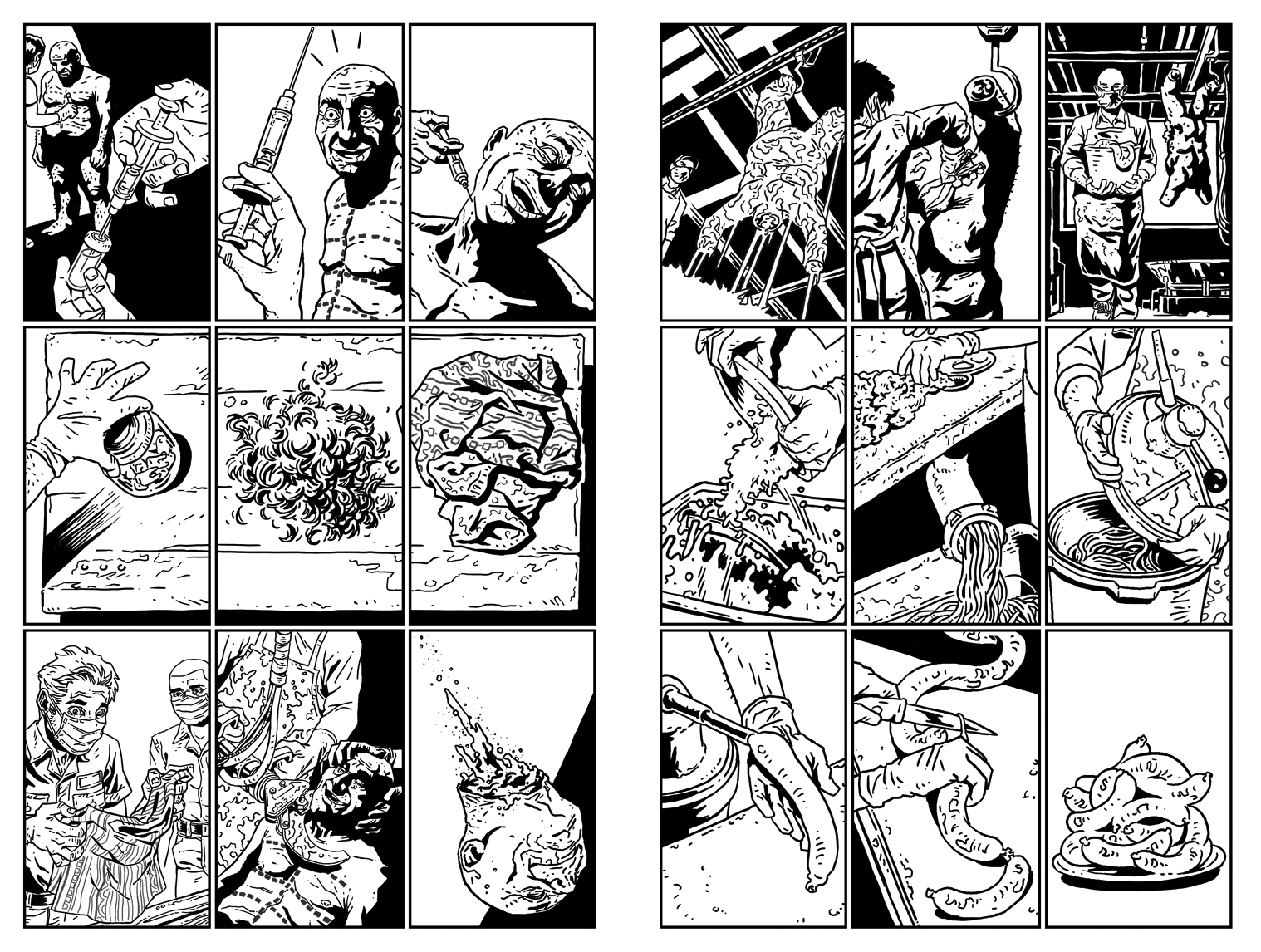
These two pages were originally scripted as 5 and 8 panel pages. When I first sat down to figure the pages out, I approached them with a more cinematic flair, but it just wasn’t working. I realized that the violent act perpetrated by these three guys may be shocking to us, but it’s actually just a regular day for them. They’re just going through the regular steps they need to in order to get the job done. I think It would be a mistake to draw this scene as wide paneled action scenes.
I eventually decided on the 9 panel grid. There’s something about the 9 panel grid that’s workman-like and procedural, which is exactly how I think the scene needs to feel. While the moments are generally brutal and unusual, the 9 panel grid renders them a little dull.
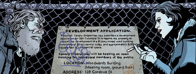
Growing up on superhero comics has trained me to approach actions scenes with a dynamic flair. There’s one scene in The Dregs #1 that you could argue is an action scene. Arnold goes to a local neighborhood meeting to investigate the disappearance of his friend and assaults a business leader whose discussing plans for gentrification of the neighborhood.
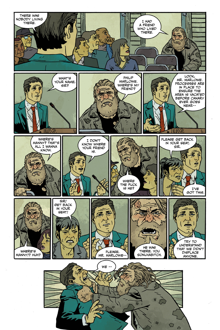
My initial instincts were to follow my usual rules and show several wide establishing shots of Arnold walking down the aisle to show him getting closer and closer while also making the spacial relationship between him and his target clear. It turned out that this was another situation where going along with my usual rules for good storytelling wasn’t working for the scene.
I realized that I wanted this page to be messy, tense and little confusing, which is how the characters experienced it.
It’s hard to control how fast someone reads a comic. But there are little thing you can do here and there to affect that. I find that smaller panels tend to make things read faster, which is contrary to the idea of wide action panels of superheros punching each other. Also. to ratchet up the intensity, I made each tier of this page add one more panel then the previous until there’s a big explosive panel at the end. Things get increasingly more claustrophobic and the panels get gradually smaller and smaller, making the eye speed up while reading.
Silence is directly proportional to the noise that proceeds it. I think this effect can also apply to panel sizes getting smaller and smaller until a big one suddenly shows up. It has a bigger impact when contrasted against what came before.
On top of all that, not clearly establishing where these characters are to each other adds to the messiness, confusion and abruptness of it all. It also makes Arnold’s eventual arrival at his target more jarring.
There are other great uses for tiny panels. For page 15, Arnold is engaging in a conversation with a woman who seems to be the personification of the femme fatal trope from the hard boiled detective stories he loves so much. The dialogue in this scene has a kind of no nonsense, rapid fire quality to it, which is typical of the genre.
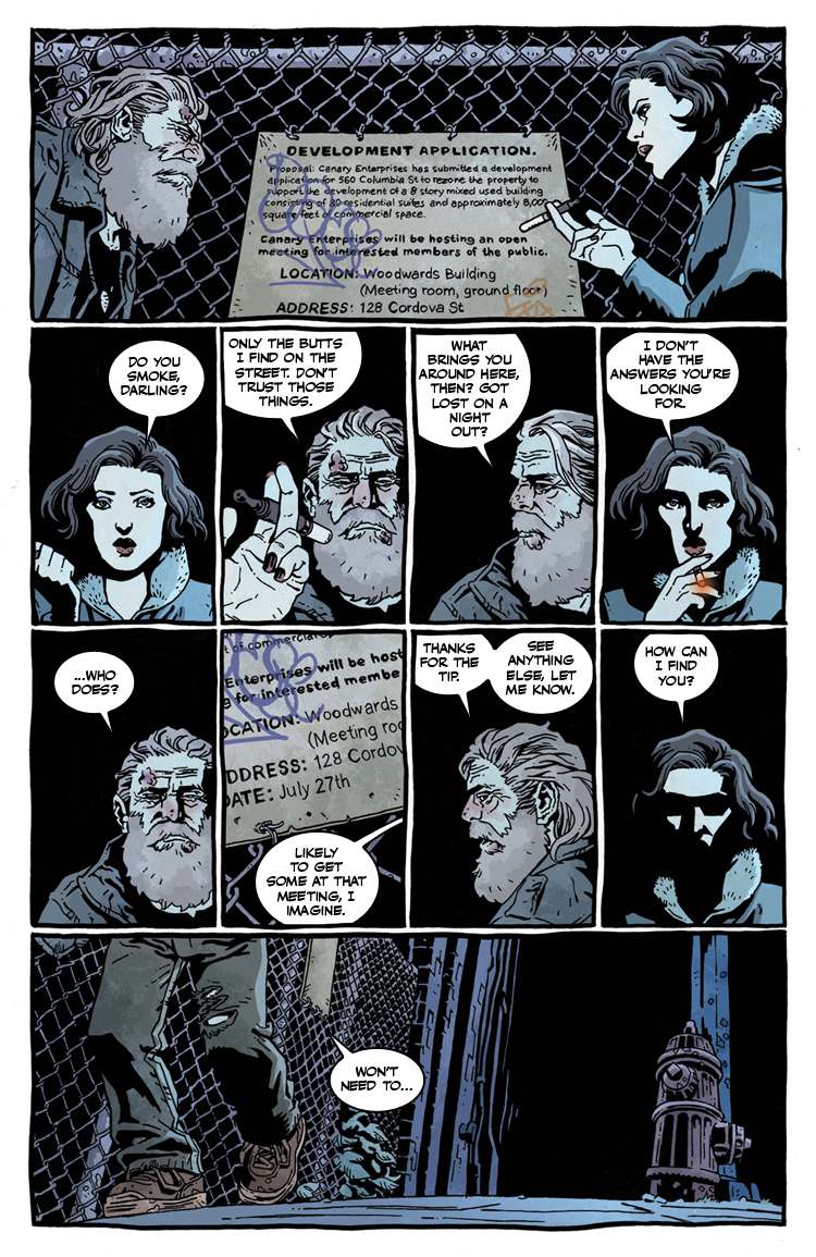
If this page were portrayed in only five or six panels, the dialogue would seem less like that.
I also think the back and forth face shots make the scene feel weird and off putting, which is my goal because the scene is weird. This woman just came out of nowhere and started talking this homeless person she just met.
The repetition of imagery also allows me to make subtle changes to the figures for acting purposes or to add a touch of the surreal. Note the changes in lighting on our femme fatal, as her face seems to retreat into the darkness until we reach the last panel where the location she should be standing in is just pitch black. This would seem like bad storytelling to just have a character disappear, but it’s very intentional for reasons I won’t get into here.
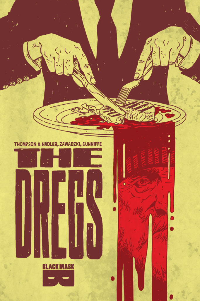
Lonnie Nadler and Zac Thompson wrote a very rich, detailed and artistic script for The Dregs #1, which allowed me to play around with my usual storytelling devices. They also requested and encourages me to play around with the script as much as possible in order to best convey these ideas. Working with them has been a joy.
Dee Cunniffe coloured all of these pages masterfully. He’s undoubtedly going to go on to bigger and better things after this project. I think this is going to be his big year.
Issue #1 of The Dregs is sold out at the distributor and has been requested enough that we’re making a second print. This is pretty exciting. This has been the biggest book of my career so far and the attention we’ve been getting has been overwhelming. The reviews have been generally very good as well. And there have been a couple of reviews that were especially heartening because they really got what were trying to do.
Issue #2 will be out March 1st. Be sure to order at your local comic store within the next week or you may miss your chance of getting a copy.
I recently started a mailing list. Please sign up to get more comics talk like this.